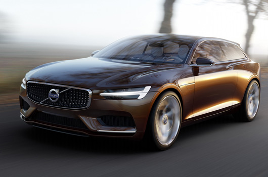
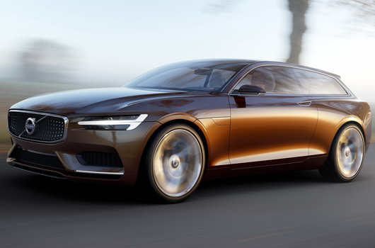
Around the middle of last year Volvo gave us the very sexy Concept Coupé. Then they turned it into an SUV, which we didn’t care for too much. Now it’s become the Concept Estate. And it’s ice cold cool.
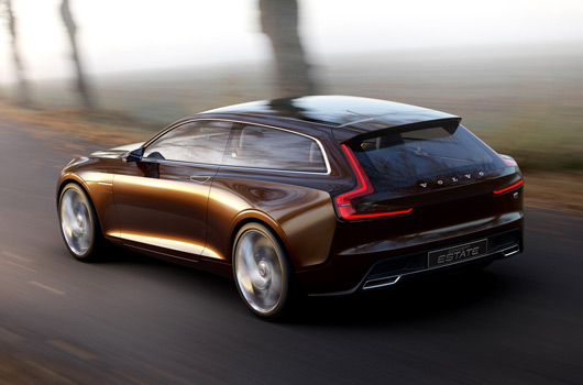
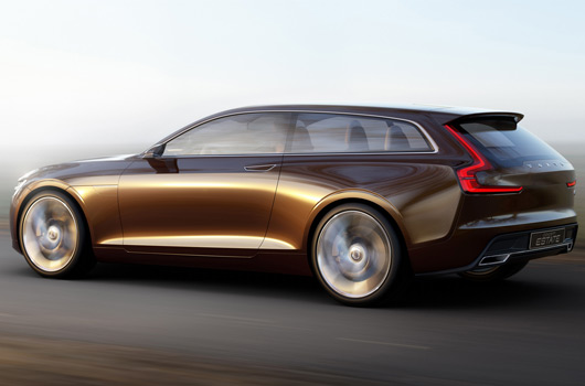
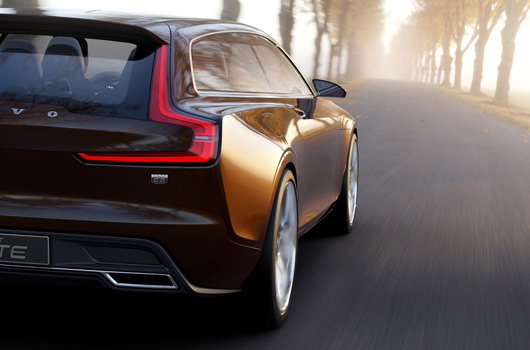
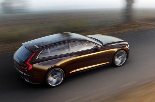
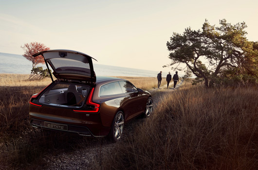
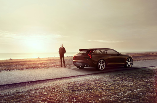
It’s so awesome and we were so smitten with its rear three-quarter profile that it took us a while to realise the car itself is that god awful brown colour manufacturers seem to love these days.
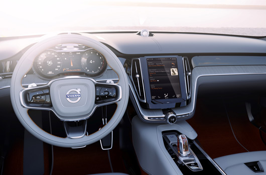
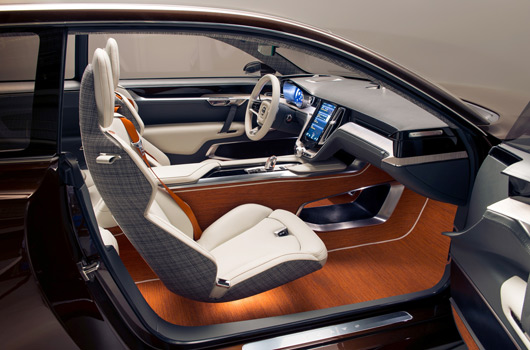
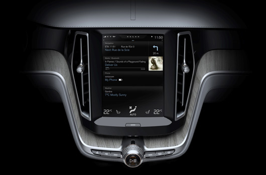
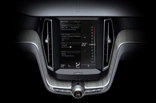
Aside from oozing Swedish style the Concept Estate’s party trick is its new electronic tablet style central dash display, used to control the car’s functions.
The sleek two-door body style will never make it into production, so we’re just going to have to enjoy this concept lark while we can.
The car itself will be on display in Geneva next week and we look forward to seeing more. In the meantime there’s pics and video for you after the break.
Volvo car group to unveil Concept Estate at Geneva Motor Show
Feb 27, 2014 – Volvo Car Group will use the Geneva Motor Show to reveal the third in a series of concept cars – the Concept Estate – that continues the widely-admired exterior design language revealed in the first two concepts, but for the first time reveals how the interior of Volvo’s forthcoming models will both look and function.
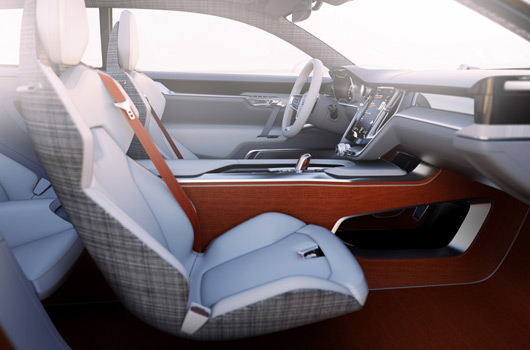
The Volvo Concept Estate’s most striking interior design feature is its simplicity. The traditional selection of buttons and controls have been replaced by one large tablet-like touch screen control panel in the centre console, bringing the interior firmly into the 21st century.
“The basic idea is to organise controls and information in a perfectly intuitive and user-friendly way. Everything is exactly where you expect it to be, making the drive more enjoyable, efficient and safe,†says Thomas Ingenlath, Senior Vice President Design at Volvo Car Group.
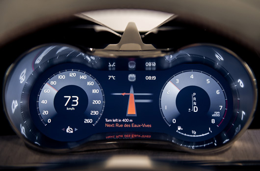
In association with Volvo’s specially designed software, the touch screen will be the main control panel for Volvo’s new in-car user experience. It replaces all buttons and controls except for a few crucial functions such as volume, play/pause, hazard warning and window heaters. It also interacts seamlessly with the digital instrument cluster in front of the driver.
“Not having to deal with buttons and controls for a growing number of functionalities is like being freed from a pair of handcuffs,†says Robin Page, Design Director Interior of Volvo Car Group. “This has made it possible to build a beautiful interior architecture around the portrait screen. The concept car showcases how this user interface will be integrated in our new car generation.â€
Volvo is the company that redefined the Estate car by combining functionality, sturdiness and practicality with performance. The V70 and XC70 are among the most respected Estates on the market and the new Concept Estate points to how the company could capitalise on this heritage in its forthcoming models.
Volvo has been on a winning streak with its concept cars. The Concept Coupé was named ‘Car of the Show’ by a leading German auto magazine at the Frankfurt Motor Show, while the Concept XC Coupé received the prestigious ‘Eyes ON Design’ award at the Detroit Motor Show.
Global attention on Volvo’s concept cars has been intensifying as they provide the first significant clues as to how the all-new and much-anticipated XC90 SUV and subsequent cars will look. The XC90 is due to be launched later this year.
Learning from history
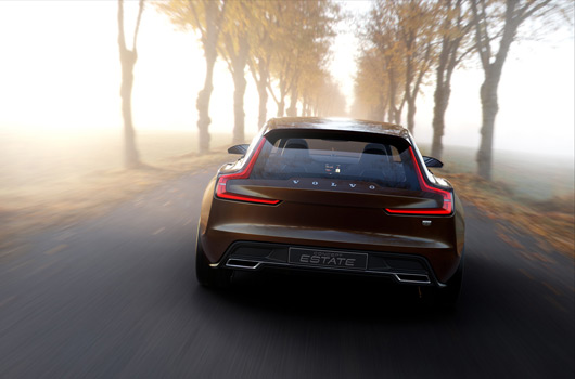
The rear of Concept Estate echoes the design of the Volvo 1800 ES from the early 1970s.
“The 1800-models are iconic Volvos, renowned for their beautiful forms and detailing. However, using elements from their exterior and interior has nothing to do with being retro. We are using these subtle links to a glorious past to create a future in which sheer beauty becomes a recognised part of Volvo’s identity,†says Thomas Ingenlath.
The subtle inspiration from the 1800-models is also evident on several details inside the Concept Estate, such as the two-spoke steering wheel, the instrument panel and the dials.
Robin Page explains: “The first four decades of the Volvo history was characterised by classic craftsmanship and high quality materials. We are merging this vital part of our brand DNA with the more recent focus on technology and smart functionality. In the Concept Estate we also add the creative side of Scandinavia. The result is an exotic interior with genuine materials and beautiful detailing.â€
Beautiful and different
Applying this approach to the iconic estate car – which is the essence of versatile Volvo functionality – creates a car that is both beautiful and different.
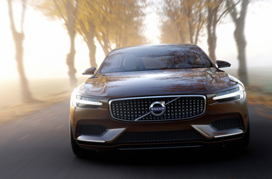
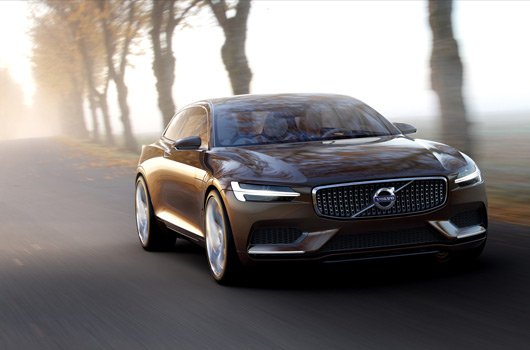
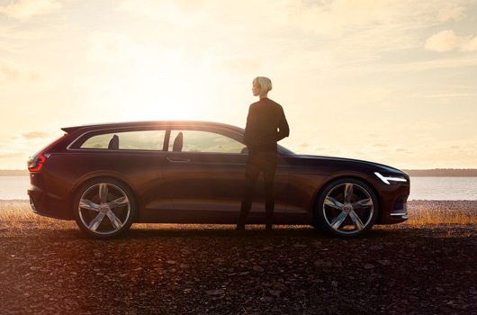
The generous dash to axle ratio, low bonnet, sleek silhouette and the glass roof all contribute to the impression of a dynamic, yet capable three-door sports wagon. The contrast between the deep, dark brown pear colour and the bright five-spoke, 21-inch wheels contributes to the modern, cool aura.
Just like the recent Concept Coupé and the Concept XC Coupé, the face of the Volvo Concept Estate is characterised by a new topography on the bonnet and the ‘floating’ grille, flanked by headlights featuring new T-shaped DRL light guides. The rear light signature is another distinctive element in Volvo Cars’ new design direction.
Swedish inside and out
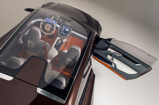
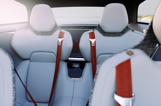
Extrovert and colourful trends within contemporary Swedish lifestyle and design have been powerful sources of inspiration for the design team. Occupants in all four seats are embraced by orange seat belts, and the exclusive, woven wool carpets from the Swedish designer Kasthall have the same deep accent colour.
The crystal gear leaver from Orrefors/Kosta Boda also has an orange glow, while the chequered black and white wool textile on the headliner and rear sides of the front seats adds playfulness to the ‘room’.
“Creativity is thriving in Swedish society. This includes design and technology as well as the fashion, music and art scene. We have used all this as inspiration to create a new, exciting way to express Sweden’s soul,†says Thomas Ingenlath.
The feel of a Scandinavian living room
Refined, handcrafted details, such as an instrument panel covered by thick, naturally tanned saddle leather from Tärnsjö, inlays made of waxed, naturally aged wood and machined copper details, also emphasise the exclusive Swedish atmosphere inside Concept Estate.
“The interior is exceptionally vivid. Yet the glass roof and seats covered by light, soft Bridge of Weir leather help to retain that bright and cosy feeling that is the hallmark of a Swedish living room. A place that makes you feel so comfortable that you are reluctant to leave,†says Robin Page.
Specially designed Swedish ‘kubb’ game
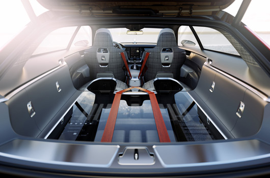
The ambiance might inspire occupants to stop for a picnic and game of Swedish “kubbâ€. The specially designed game set is visible through the load floor in the back.
“Don’t know the rules? No problem. They are printed on the transparent floor. And rain is no excuse. You will find exclusive Stutterheim raincoats in the back of the car as well,†explains Robin Page.
Volvo’s Partner Suppliers in the creation of the Concept Coupé, Concept XC Coupé and Concept Estate:
Tyres: Pirelli
Wheels: Uniwheels
Leather: Bridge of Weir
Exterior paint: Axalta Coating Systems
Carpet: Kasthall
Gear shift: Kongsberg
Gear shift glass: Orrefors
Exterior light: Valeo
Belts: Autoliv
Interior ambient light: 3M
Design and technology at the heart of Volvo Car Group’s new in-car experience
Sleek Scandinavian design and intuitive technology to reinvent the car interior.
Volvo Car Group will use the Geneva Motor Show to reveal its new in-car control system, which is designed around a large tablet-like touch screen that will simplify and enhance the way drivers operate their cars.
The touch screen replaces the traditional selection of buttons and controls in the centre stack with one clean and sleek control panel. It will blend established tablet functionality, such as swiping and pinching, with new solutions that are specially designed for the in-car environment. It also interacts with the digital instrument cluster in front of the driver.
“The basic idea is to organise controls and information in a perfectly intuitive and user-friendly way. Everything is exactly where you expect it to be, making the drive more enjoyable, efficient, and safe,†says Thomas Ingenlath, Senior Vice President Design at Volvo Car Group.
This ground-breaking driver experience will be introduced in the next car generation, starting with the all-new Volvo XC90 later in 2014.
“The new user interface is designed to create a smooth, logical and safe interaction between the driver and the car,†says Thomas Ingenlath. “This goes far beyond just putting a large tablet in the centre of the dashboard. We have created a digital environment that is fully integrated in the car.â€
Logical stack of four ‘tiles’
The layout on the portrait screen can be described as a stack of flexible ‘tiles’, each displaying a key functionality. Navigation is on the top, followed by media and telephone.
A thin notification band is located above the tiles, while the digital climate controls become the ‘foundation’ of the pile.
“Information, navigation and media are high up and easy to keep an eye on. The phone controls, application icons and climate controls are located low, comfortable to reach and touch. Using the screen is so logical that it will be part of your muscle memory very quickly,†explains Thomas Ingenlath.
The smooth user interface also includes thumb-reach controls on the steering wheel and extensive voice-control possibilities.
Digital solution
The new user interface is designed so that the tiles on the touch screen expand on interaction. When one of the tiles expands to display required information, the others are compressed, still visible and instantly accessible.
“Having all functions present all the time makes the touch screen exceptionally user-friendly. The spacious layout also promotes smooth interaction without distraction,†says Thomas Ingenlath.
Crystal clear but calm
“Creating this crystal clear, yet calm, environment is a core part of our digital craftsmanship. It is fine for an ordinary tablet to fight for your full attention but a touch screen in a car is very different. Information must be clear and user-friendly, without turning up the visual volume so much that you risk losing focus on the road. This also makes it easier to make really urgent information, such as a warning, much more distinctive,†concludes Thomas Ingenlath.
2 replies on “Volvo Concept Estate revealed”
Totally agree with you on the looks of this – just gorgeous.
I will save every penny I have for this car .Simply beautiful!