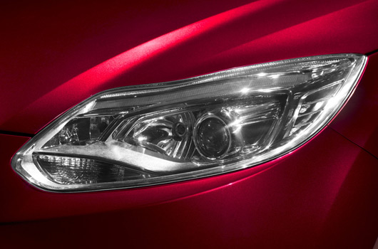
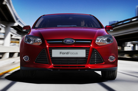
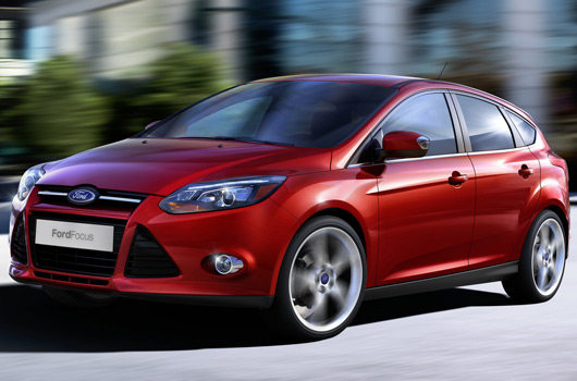
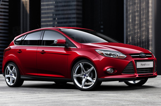
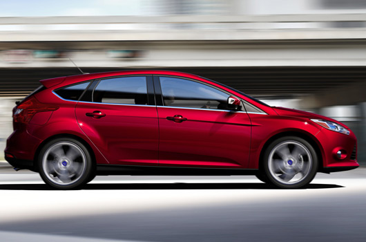
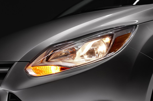
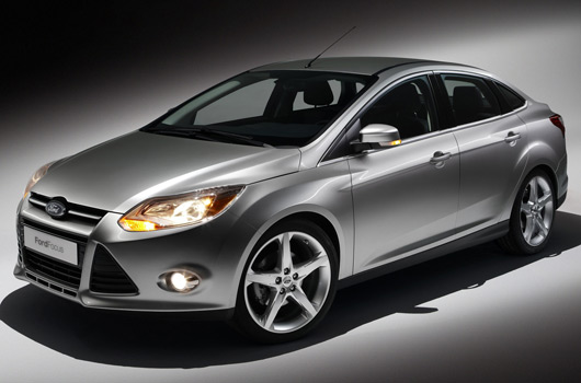
It’s now a couple of weeks since Ford presented the 2011 Focus at the Detroit Auto Show. With the dust settled, let’s take a closer look at the funky sheet metal carving a new direction for Ford. They call it “kinetic design” and there’s a real hint of Chris Bangle flame surface going on. Not that this is entirely new, as the current Fiesta is also cut from the same cloth.
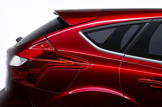
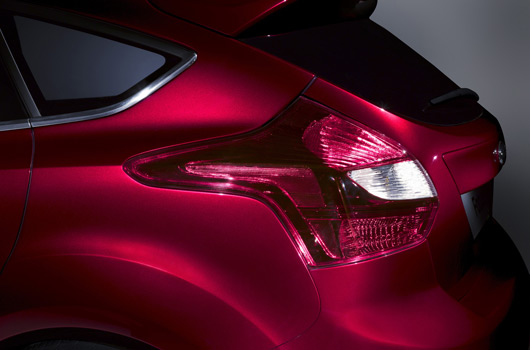
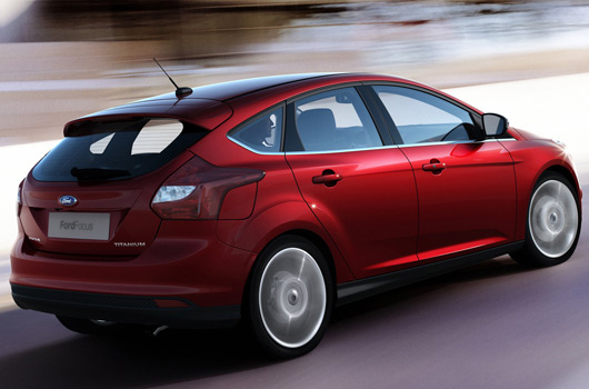
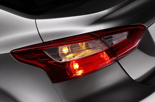
Look closely at the pic above and the way the rear light cluster extends towards the front of the car. At first glance it looks okay, but picture it on a silver or light coloured car. Is that forward extension going to look just a bit too much?
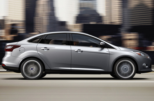
The fuel cap slotting in underneath is also an interesting solution. Again, at first glance it’s a nice way to tuck the lid away. But would a more conventional round lid, as shown on the Focus sedan, have been a better result? Is “kinetic design” trying a bit too hard?
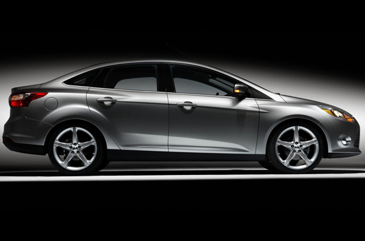
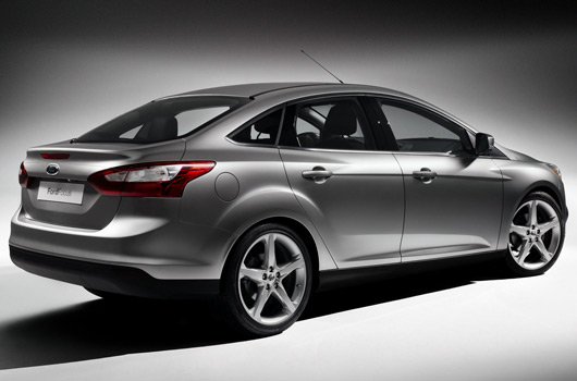
In the last image below, which shows the sedan version from the rear three-quarter angle you get a great look at the creases extending over the wheel arches and the shoulder line along the doors. In theory, the way they run past each other simply shouldn’t work. Maybe it’s the choice of the silver paint and the studio lighting, but there’s something pleasing about the craziness going on there.
The new Focus and the “ONE Ford” global car platform strategy holds great hope for the US carmaker. Despite some reservations I think thew new Focus is a good step forward (on the outside at least). But will this bold new direction pay the required dividends?


One reply on “A closer look at the 2011 Ford Focus”
It looks ok from the front but the rest is hideous and will date horribly.
And yes, the hatch rear lights are terrible. They look like a groping leech.