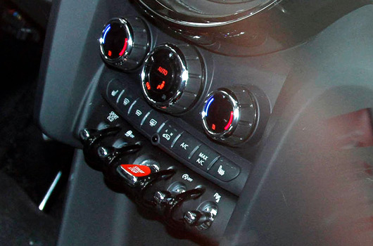
German magazine Auto Motor und Sport brings us the best look inside yet of the new F56 MINI platform. Above you can see the new style toggle switches and an increase in black plastic interior trim. Eagle eyed observers will also note there are no longer toggle switched for the windows in the central stack.
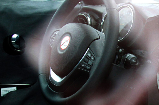
It’s all part of the apparent maturation of the MINI brand and, we think, some of the brand’s playful character is being lost. This is further evidenced by the removal of the centrally-mounted speedometer. The speedo will now sit atop the steering column, with a smaller dial beside for the rev counter (see image below).
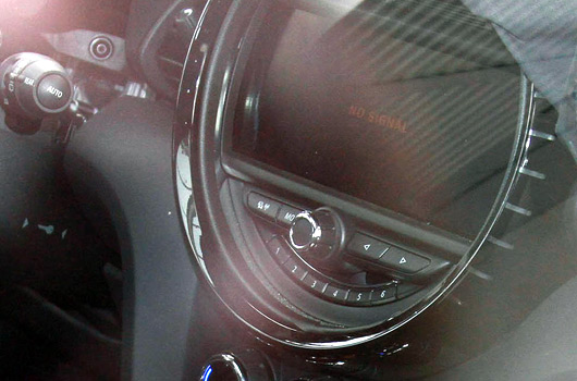
An infotainment screen, mounted inside a circular shape, will sit in the middle of the dashboard where the speedo used to be placed. It follows a similar look to current generation MINIs that are equipped with either satellite navigation or Visual Boost. Although, there’s no speedo around the outside, of course.
[Source: Auto Motor und Sport via MotoringFile]


3 replies on “A look inside the new MINI”
Like the look of the start/stop switch in the centre console (if that’s what it is). I think, so long as they improve the ride and squeaks and rattles in the dash/doors, the next Mini could be the best yet.
Interesting comments here from Evo’s review of the Paceman prototype:
http://www.evo.co.uk/carreviews/evocarreviews/286087/2013_mini_paceman_cooper_s_review.html
“Mini has relocated the Paceman’s electric window switches from the centre console to the inside of the doors – a far more obvious place for your fingers to look for them. The rest of the switchgear is as chaotically distributed as before, though.”
[…] This is probably the best look inside the new MINI you’re going to get until official pics are released. It’s over a year since we got our first peek inside the F56. […]